
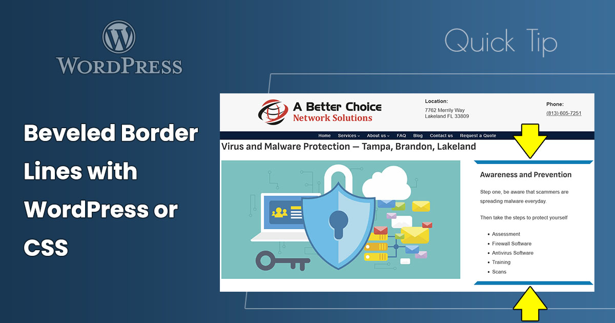
Here’s a quick tip to create beveled borders on WordPress blocks with the WordPress block editor or with cascading style sheets (CSS).
Here’s how in the WordPress block editor.
In the example below, a Group block is used, and the beveled lines are on the top and bottom.
- Open a page or post and select a block that can have borders.
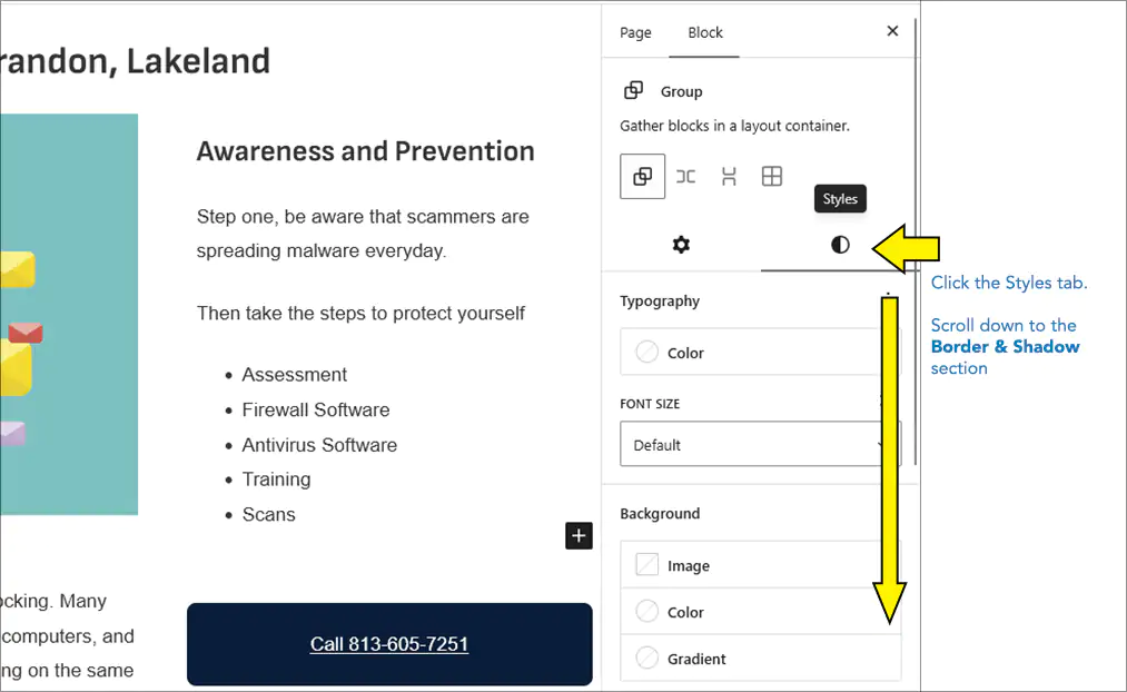
- In the Block Settings sidebar, click the Styles tab.
- Scroll down to the Border & Shadow settings.
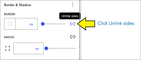
- Under BORDER, click the Unlink sides button. This separates the four sides into four separate settings.
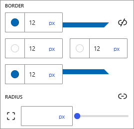
- In the top and bottom Border color and style picker, select a color and enter a border width.In this example, it’s blue and 12px.
- In the left and right Border color and style picker, enter the same border width and select the color to match the background behind the block. In this example, it’s white.
Helpful Link – Borders in WordPress
Learn how to edit borders in WordPress here: Border & Shadow Settings overview at WordPress.org
Beveled Lines Using CSS
WordPress uses CSS for borders, so you can do this with any website editor that allows you to add and edit CSS. Use this as a start and adjust to your preferences.
.your-selector {
    border-width: 12px;
    border-color: blue white;
}
Here’s an example using CSS code, not WordPress point-and-click features.
This text is in an HTML DIV with CSS applied to create the beleved borders on the top and bottom
New (2025) CSS property corner-shape – Not Widely Used, Considered Experimental
A new CSS setting to create beveled corners is in the works, but it’s not implemented in most widely-used browsers. I was able to create a similar effect in Chrome with the CSS below, but it doesn’t work in FireFox, and Safari is still experimental. For now, don’t use it, but this might be an up-and-coming option for similar effects in the future.
Here’s the CSS that works in Chrome:
.your-selector {
  width: 100%;
  background-color: white;
  border-style: solid;
  border-width: 12px;
  border-color: blue white;
  border-radius: 2px;
  corner-shape: bevel;
}
Helpful Link – Learn About corner-shape
Learn about corner-shape at Mozilla’s MDN: corner-shape CSS property
Conclusion – Another Technique to Keep in Your Web Design Toolbox
This beveled-lines technique is easy to do in WordPress. For those who work with CSS code, it’s an easy bit of code. Keep this your design toolbox.

